Visual design covers many areas, but to ensure your website is aesthetically pleasing wewill work with you to follow a few simple rules -
Planning Your Website
Who is your site for? What message do you wish to relay? Consider carefully the audience, in terms of age, preferences and computer literacy when choosing a layout for your site
- Who is the site for - a pensioners club will generally have slightly different requirements to a heavy metal band.
- What is the purpose of the site - is it a private ecommerce site for employees, a site to promote products for a retail outlet, or an informational site for a community organisation ...
- Who is the target audience - if the target audience is mainly teenagers then the site may have lots of loud colour and animations, if however the main audience are accountants then the site should be very plain and easy to navigate.
- Content - what actual content will go on the site
- Layout - determine the basic layout and navigation for all pages in the site. Consistency is important.
Colour
When designing your website, you have a particular message to deliver, and colour is a very direct tool to stir emotions and direct user behaviour.
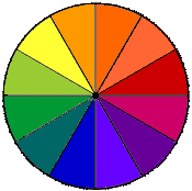 Subtractive Colour Wheel
The subtractive colour wheel is composed of a sample of colours that include the three primary colours and a number of secondary, intermediate and tertiary colours. Using this wheel when selecting your main website colours can be helpful in deciding on the use of complementary versus contrasting colours, or a mixture of both.
Using the wheel, colours that are alongside each other are considered to be similar. Those that are opposite each other on the wheel are said to be complementary, and those at least three colours away from another on the colour wheel are said to contrast.
For website display, most sites choose to select a single base colour (in this website, for example, we chose a shade of pale brown) with one secondary colour which is either complementary or contrasting (in this website, we chose pale green), and then additional tones (for borders or subheading, in example) which are similar to both these colours (in this website, that is a darker brown and a darker green).
Culture and Colour
In Western culture, each colour has a particular significance. Red for love, passion and heat; green for peace, nature, fertility; blue for clarity, dignity, truth; yellow for joy, energy; purple for wealth, sophistication; brown for masculinity, stability; black for death, elegance, rebellion; white for purity and cleanliness.
Be aware though of other cultural perceptions. In many Eastern cultures, white represents mourning, and purple, a sign of royalty in Western culture, represents prostitution in the Islamic world. Know your audience before making final colour choices!
Alignment
Look at each paragraph and element on this page. You will see two basic alignments: centred, which is used for the heading and left-justified which is used for the balance of the page and sub-headings. Most designers would say "choose one alignment and stick to it for the whole page". So, as per this page, main headings are centred then sub-headings, text and images are left aligned. But most designers will also break their own rules from time to time - just to add interest to the page!
So, for example, if you had one single message on your page that you wanted to draw attention to, you could add an image and right-justify it, with some bold text as a heading above it, or, you could add a centred heading within the text of your page to make those words jump out at users. In general, however, when designing your page, use alignment as a tool for consistency, neatness and appeal.
Proximity
In general, an image, or a heading, which relates to text should be in close proximity to it (near/next to). For example, when discussing the Subtractive Colour Wheel above, the text is immediately to the right of the image. This proximity allows your readers to clearly follow your information, and it is easier to guide customers to products they may need.
Repetition
Repetition is about repeating certain elements all the way through a site. For example, you'll see that on this page there is a single page heading, then left-justified text with headings throughout. Also, note that every page in this website has a banner, centred at the top, shows the top and left menu, and the page footer. Plus the background is constant on every page.
All of this repetition gives a sense of identity to each page. When you move from this page, the next page will look similar. This gives a sense of reassurance that you haven't left the site and wandered off somewhere else by mistake.
One drawback to repetition, of course, is that the pages all have a certain sameness about them. There are a few tricks you can use to allow repetition, but with some variety. We discuss these in "Contrast"
Contrast
Contrast draws your eye into the page and makes you want to look at it. With careful design, contrast will lead your eye around the page - a great tool for website designers looking to guide customers to a certain product or point of interest in your website or page.
To use contrast, the first thing you need to do is to create a focal point for the page. Often this will be a graphic or combination or graphic elements. The real focal point of the page is the most important element on the page. If everything on the page is the same size, then everything has the same level of importance. This will never be the case: there is always something on the page that is more important than everything else.
Some of the techniques you can use to create the focal point are to use a large, well-chosen graphic, a headline within your text or an illustration (photograph or drawing) of the main subject.